A practical guide to designing screens that get noticed, read, and remembered, even when viewers only glance for a second or two.
Key Takeaways
Most digital signage problems people blame on the software or the screen are actually design problems. The hardware works fine. The CMS works fine. The layout is the thing that’s broken: too much text, contrast that fails in real-world lighting, fonts a passerby can’t read at three meters, or animations that distract from the message instead of pulling the eye toward it.
Good digital signage design starts from a tight constraint: you have one or two seconds to communicate before the viewer moves on. Every rule, formula, and template choice that follows exists to respect that window. This guide covers the visual fundamentals, the technical specs that decide whether your work survives the jump from laptop to wall-mounted display, the recurring mistakes, and a system you can apply across one screen or a thousand.
Why digital signage design decides whether your screens work
Design is the variable that separates a screen that attracts attention from one that fades into the wall: same hardware, same software, same content slot, completely different outcomes. The difference is whether the layout was built around how people actually read displays in physical spaces, or whether someone treated the screen like a slide deck with no audience.
Whenthe design works, the numbers follow. The Out of Home Advertising Association of America reports that out-of-home advertising, including digital formats, produces significantly higher ad recall with consumers than other media. Recall at that level only happens when the design respects the viewer’s attention budget, the physical environment, and the limits of human visual perception at distance.
Three factors account for most of the gap between a screen that performs and one that doesn’t.
This guide walks through how to get each of those right, plus the technical specs and recurring mistakes that quietly derail otherwise solid designs.
The glance medium: designing digital signage for 1-2 seconds of attention
Digital signage is a glance medium, and that single fact reshapes every design decision that follows. People walking through a space aren’t stopping to read; they’re heading somewhere else, and your layout has roughly one to two seconds to register before they’re past it. Anything that takes longer to decode is invisible.
Designers who haven’t internalized this build for the wrong context. They design as if the viewer is sitting in front of the screen, which is how web pages get consumed, not signage. The result is paragraph-length copy, four content zones, and decorative elements that compete with the message. Every one of those choices burns time the viewer doesn’t have.
The fix is to design for the fixation the viewer can spare, not the dwell time you wish they had. A fixation is the brief pause, typically 200 to 300 milliseconds, when the eye lands on a single point and processes what’s there. A glance is a chain of three or four fixations before attention shifts, giving you about a second of useful processing per pass. Whatever the screen is trying to communicate has to land inside that window.
Three viewer modes: passing by, waiting, lounging
Not every screen lives in the same context, and the design rules tighten or loosen depending on which mode the audience is in. Three patterns cover most environments.
The mistake most teams make is designing one layout and pushing it across all three modes. A passing-by screen with three content zones and a ticker is unreadable in motion. A lounging screen running a single five-word message wastes the viewer’s available attention. The design has to match the mode.
💡 Pro tip by Yodeck Team: Audit your screen network by viewer mode before you redesign anything. Walk the space, time how long real visitors stand near each screen, and tag every display as passing, waiting, or lounging. The audit alone will surface layouts that don’t match their context, and that’s usually where 80% of the design problems live.
The design fundamentals every screen needs
Once you’ve accepted the glance constraint, five fundamentals do most of the work: hierarchy, layout, color and contrast, typography, and motion. Get these right, and the rest takes care of itself.
Visual hierarchy in digital signage: the one-message rule
A digital signage layout should have one job. One primary message, one supporting element if needed. Hierarchy tells the viewer’s eye what to look at first, second, and third, and a screen without hierarchy is a screen where everything competes equally, and nothing wins.
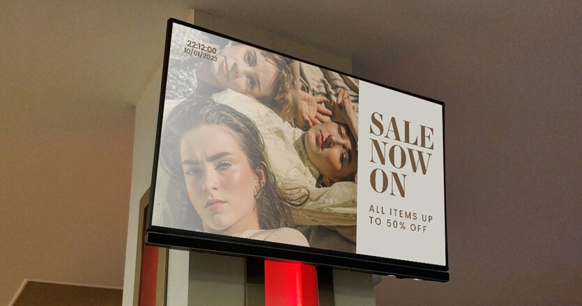
The cleanest way to enforce hierarchy is the 80/20 rule for screen real estate: roughly 80% of the visible area carries the primary message (a headline, hero image, price, or key data point), and the remaining 20% holds branding or one secondary element. If you can’t decide what the 80% is, the design isn’t ready.
Most cluttered signage breaks this rule by giving everything equal weight. The fix is ruthless: pick the one thing the viewer needs to take away in one second, make it dominant, and let everything else recede.
Digital signage layout: zoning, the 3×5 rule, and reading patterns
The 3×5 rule keeps text under control: stick to either three lines of text with around five words each, or five lines with three words each. Anything beyond that exceeds what a passing viewer can process in one glance.
Reading patterns matter for how you arrange that text. The F-pattern, documented in eye-tracking research by Nielsen Norman Group, describes how viewers scan content-heavy layouts: a horizontal sweep across the top, a shorter sweep partway down, then a vertical scan of the left edge. For text-driven signage, that means anchor the headline top-left and the call-to-action along the left axis or in the upper third.
The rule of thirds divides the screen into a 3×3 grid and places key elements at the intersections, not dead center. Off-center compositions create more visual tension and pull the eye more reliably than centered ones.
A few zoning rules close out this layer. Always leave a safe area of roughly 5% around the edge of the design so nothing critical disappears off-screen.
Avoid layouts with more than three content zones unless viewers are in lounging mode. And keep the layout consistent across a content series; switching grid systems mid-playlist breaks the visual rhythm.
Color contrast for digital signage: the 4.5:1 WCAG rule
Color does two things on a screen: it directs attention and it determines whether the text can be read at all. Both functions depend on contrast.
The Web Content Accessibility Guidelines (WCAG 2.1) set the minimum contrast ratio at 4.5:1 for body text against its background, and 3:1 for large text (18pt regular or 14pt bold and above). These are accessibility standards, but they double as design standards because they’re the threshold at which most viewers, including those with low vision, can read text reliably.
The practical rule that follows: light text on dark backgrounds, or dark text on light backgrounds, with one color holding the dominant background and the other carrying the message. Anything in between, light gray on white or mid-tone on mid-tone, fails the contrast test before the design reaches the screen.
Stick to a palette of three to five colors total, drawn from your brand system. Use one accent color for calls-to-action so viewers learn to associate that color with the action you want them to take. And remember that ambient light changes how colors render: a screen in a sunlit lobby loses contrast that the same design holds easily in a dim corridor. If the install environment is bright, push contrast higher than the 4.5:1 minimum. Yodeck’s guide to color schemes for digital signage goes deeper into palette selection.
Digital signage typography: font size by viewing distance
Type is where most signage falls apart. The single biggest typography mistake is sizing fonts based on what looks right on a designer’s monitor instead of what’s readable from where the viewer will actually stand.
The industry rule of thumb is 1 inch of letter height for every 10 feet of viewing distance (roughly 25mm per 3 meters). That gives you minimum legibility for body text. For comfortable reading, push it to 1.5x that minimum. Translated to point sizes on a typical 1080p display, that lands at:
| Viewing distance | Minimum body text | Headline |
|---|---|---|
| 6 ft (~2m) | 24pt | 48pt |
| 10 ft (~3m) | 36pt | 72pt |
| 15 ft (~4.5m) | 48pt | 96pt |
| 20 ft (~6m) | 60pt | 120pt |
| 30+ ft (~9m) | 84pt+ | 168pt+ |
These are floors, not targets. If anything’s borderline, go larger.
Stick to sans-serif fonts like Helvetica, Arial, Inter, Roboto, or Open Sans. Sans-serif faces have larger x-heights and cleaner letterforms that hold up at distance and at low resolutions. Serif and decorative fonts lose detail when scaled up and slow down recognition because the eye has to work harder to parse the letterforms.
Cap your designs to two typefaces maximum, ideally one for headlines and one for body. Use weight (regular, medium, bold) to create hierarchy within a single typeface family rather than introducing additional fonts. Avoid italic, condensed, or extended cuts for primary text; they reduce legibility for almost no design payoff.
Animation in digital signage: one motion element per screen
Motion attracts attention because the human visual system is wired to detect it. That makes animation a powerful tool, and an easy one to abuse.
The rule is simple: one prominent animated element per screen at any given time. A subtle ambient animation in the background (a slow gradient shift, the Ken Burns effect on a hero image, a gentle parallax) plus a static layout works. A ticker plus an animated weather widget plus a video plus a flashing CTA does not. Multiple animations compete for attention the way multiple content zones do.
A few concrete guidelines: transitions between slides should run 0.3 to 0.5 seconds, since anything faster reads as a glitch and anything slower feels sluggish. WCAG flags content that flashes more than three times per second as a seizure risk for viewers with photosensitive epilepsy, so avoid rapid flashing entirely.
If the screen is showing video or motion graphics in one zone, freeze the rest so the eye can rest and focus pulls to the moving element. And auto-play video without sound by default; most signage environments don’t have audio, and viewers can’t make sense of muted dialogue.
Resolution, aspect ratio, and file specs that don’t break your design
A layout that looks sharp in your design tool can land on the screen pixelated, stretched, or cropped if the technical specs don’t match. Resolution, aspect ratio, and file size are the three settings that decide whether the design survives the trip from your laptop to the display.
Digital signage resolutions: HD, Full HD, and 4K
Resolution is the pixel grid your display renders. There are three common resolutions:
The design implication is straightforward: build your assets at the native resolution of the display, not below it. A 1280-pixel-wide image stretched to a 1920-pixel-wide screen loses sharpness immediately, and on a 4K display, the same asset becomes mush. Always design at native resolution and downscale if needed; never upscale.
Aspect ratio: landscape, portrait, and everything in between
Aspect ratio is the proportional relationship between screen width and height. Standard digital signage runs in two orientations:
A few non-standard ratios show up in specific use cases. Tablets and some interactive kiosks run 4:3 (closer to a square). Stretched displays for retail shelf edges, transit info boards, and ribbon LED installations can run 32:9 ultrawide or 64:9. And custom video walls built from multiple panels can take any ratio the installer assembles.
The rule for any non-standard ratio: confirm the exact pixel dimensions before designing, and build the layout to those dimensions from the start. Resizing a 16:9 design into a 32:9 strip after the fact seldom works.
File formats and size limits
The last technical layer is the file format. Different content types have different requirements:
Two practical notes:
First, always design your raster assets at 2x the target display resolution if you can; the extra detail gives you headroom for cropping or repositioning without quality loss.
Second, when sourcing stock imagery or screenshots, check the source resolution before you commit to a design. A blurry image at 1080p will be embarrassingly blurry on a 4K install.
Designing for context: matching layout to where the screen lives
Context decides what works. The same layout that lands beautifully in a quiet hotel lobby will fail in a busy airport concourse. Five environmental variables shape what the design has to do: viewer dwell time, viewing distance, ambient light, foot traffic speed, and the emotional register of the space.
The clearest way to operationalize this is to map your layout choices to the viewer mode you established earlier (passing by, waiting, or lounging), then layer the environmental specifics on top.
A layout decision matrix by viewer mode
| Variable | Passing by | Waiting | Lounging |
|---|---|---|---|
| Typical dwell time | 1–2 seconds | 30 sec – 2 min | 2+ minutes |
| Content zones | 1 (full-screen) | 2 zones max | Up to 3 zones |
| Word count per slide | 5–7 words | 15–25 words | 40–60 words |
| Message duration | 8–12 seconds | 12–20 seconds | 15–30 seconds |
| Video | Avoid (or 5-sec loops) | Short clips, 15–30 sec | Full-length, including news/dashboards |
| Tickers and widgets | None | Optional, one max | Multiple acceptable |
| Font size floor | Headline-only, large | Headline + body | Headline + body + supporting |
| Animation | Subtle, ambient | One animated element | One prominent + ambient OK |
The principle underneath it: as dwell time increases, the design can carry more information. As dwell time shrinks, every element has to justify its place.
Industry-specific context notes
Beyond viewer mode, the industry the screen lives in shapes tone and content density:
The mistake to avoid is designing once and pushing the same layout across every context. A retail layout on a healthcare waiting room screen feels jarring even if every design rule was followed.
Lighting and viewing angle: the often-ignored variables
Two environmental factors trip up otherwise-solid designs.
💡 What we’ve seen work: The single most reliable predictor of whether a digital signage design will work in production is whether the designer ever physically stood where the viewer will stand. Designs built entirely from the desk fail more often, and in more predictable ways, than designs built after a site visit.
A digital signage design checklist: fill this in before you design
Most signage fails because the design started before the thinking did. A pre-design checklist flips that order. Filling out the answers below before opening your layout editor surfaces the constraints that should drive every layout decision, and forces you to commit to a primary message before color, type, or composition enter the conversation.
Use this as a one-page template. Copy it into a doc, paste it into your project management tool, or print it and tape it next to the monitor.
1. Screen context
2. Audience
3. Message
4. Technical specs
5. Brand and accessibility
6. Lifecycle
If you can answer every line above before opening the design tool, the layout will almost design itself. Most of the hard decisions in digital signage aren’t visual; they’re about constraints, and this checklist is where the constraints get nailed down.
Design effective digital signage with Yodeck’s free templates and Canva integration
Good design rules only matter if they’re easy to apply. The right tooling is what separates teams that keep iterating from teams that ship one screen and walk away.
Yodeck gives you a starting library of 700+ free digital signage templates covering menu boards, internal communications, retail promotions, and wayfinding, all editable in the layout editor with custom font upload (TTF, OTF, WOFF) for brand typography.
The Canva integration connects directly to your Canva designs through a Smart Embed link, so any edit updates your signage in real time.
Beyond static content, the digital signage apps library covers weather widgets, social media walls, RSS feeds, dashboards, and 130+ other integrations that drop into a layout without custom development.
The first screen is free, forever. Sign up, apply the rules, see what works, and scale from one screen to one thousand on the same platform.