Choosing the perfect digital signage font for all your content needs is incredibly important.
Think you can just select whatever font tickles your fancy? You’ll be making a huge mistake if you do. The wrong kind of digital signage typography may cost you target viewers, customer engagement and profit. But the good news is with a couple of smart choices, you’ll have the perfect font for digital signage content that grabs your target viewer. Below you’ll find some practical advice that will help you choose the most suitable digital display font to suit your needs.
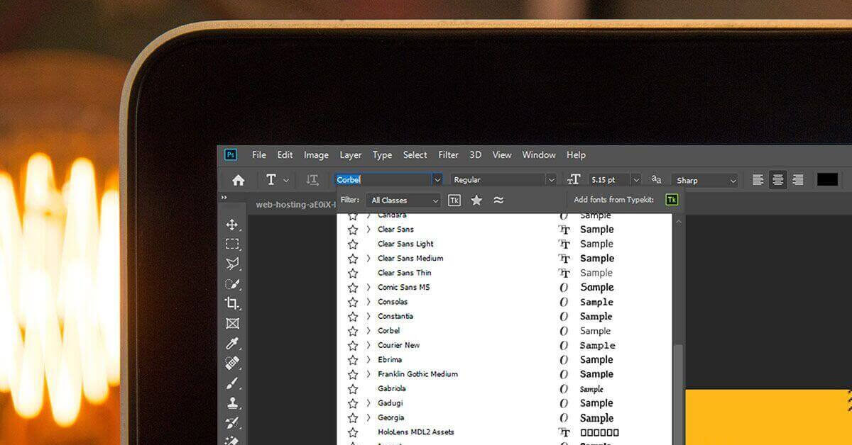
Are you wondering what your default font would look like on a digital signage screen? You can try it out for free.
How to Choose the Perfect Font for Digital Signage Content
So what font is the most attractive for digital signage? The answer actually depends on what your objective is and how much you’re willing to experiment. However, if you follow a few essential design principles, you’ll be able to choose a digital signage font that will look good on any screen in no time. Here are some insider tips on how to pick the best font for your digital signage content.
The best fonts for signage are always easy to read
You’re all excited about your digital signage system and what it’ll do for your business. It’s no wonder your first instinct is to go overboard with your content style. And the first victim of your over-enthusiasm is usually your digital signage font. Why not go all fancy and choose that awesome filigreed cursive that looks like it jumped out of an old manuscript? It’ll stand out, right? You bet. But for all the wrong reasons.
The one goal you should have when you choose a digital text font is readability. You want to get your message across to your target viewers. It’s vital for your business, school or organization. You’ve put a lot of thought into your content and made sure you’ve optimized your branded message. Don’t drop the ball by opting for a digital signage font that’s unique and ostentatious. Because it won’t be easy for people to read. It’s unfamiliar, hard to scan in a few seconds and instead of focusing on your message they’ll be trying to figure out your fancy font.
Sans Serif/Serif font combinations are the best for digital signage
Most of us just go with whatever font is pre-selected in our word processor. You can’t do that with your digital signage. If you want the perfect font for digital signage content, stick to Sans Serif and Serif fonts. They’re easy to read, and people are used to them in their daily life, which means your message will be what’s in the spotlight.
What’s even better is if you choose a Sans Serif font for your headline text. Advertising a sale? Sans serif should be your go-to digital signage font for the headline in that slide. Why? Because research has shown that sans serif font makes it easier for people to understand what you’re saying in a short period of time. And that’s exactly what you’re going for with your digital signage typography: a punchy message in just a few seconds.
But you’ve got to make your text visually attractive as well. Something that looks awesome will attract a whole lot more attention. This means you can mix it up and use a serif font for any text longer than the headline message. Sure, most digital content relies on sans serif font, but we’re used to reading serif fonts in books, newspapers and magazines. Why not make your message stand out? In fact, serif font might be making a digital comeback, giving your text a splash of style. You’ve got to play with your fonts to make your text pop. Combine different text sizes with a sans-serif/serif mix and you’ll be sure to rock that message.
Word to the wise: Limit your font style and size to a couple per slide. It keeps your text sleek and easy to read. It’s tempting to experiment, but you won’t be happy with the messy on-screen results.
DON’T use all caps with your digital signage font
See what I did there? Bet y’all thought I was gearing up to give you a lecture with that capitalized “don’t”. Lots of people think using all capital letters will get more people to pay attention. They won’t. Not only does it seem like your pretty little digital signage slide is shouting at your viewers, but all caps also make it harder for people to read what you’re saying.
Research shows people need more time to read capital letters and all caps also tend to blur together. Which kills your digital signage strategy. Your target viewers just won’t hang around to make sense of your content. You need them to read and absorb your message in the span of a few seconds.
If you want your headline text to stand out, use a different style and size of digital signage font. Or experiment with a color scheme ideal for digital signage. Don’t use all caps if you want the perfect font for digital signage content. And don’t forget to check your screens every time you experiment with fonts and design!
Your digital signage font must match your branding
Whether you’ve got a company, retail store, diner, church or school, I’m sure you’ve thought of your branding. That specific style associated just with your organization. It’s in your logo, letterhead, banners, online and print material. People see it and know it’s you. Make sure that your new digital signage font fits the bill.
Perhaps you’ve already got a branded font you use for ads and online. You can lift that same font for your digital signage text as well. Make small adjustments to make sure it reads well on your screens and you’re good to go. The best part is it will always instantly remind people they’re reading about you. And that reinforces customer engagement. You can also use your company colors for the font or other graphics. Or have the branded font style echo in other design elements. Never forget your branding when you choose the perfect font for digital signage.
Digital signage fonts & images must work together
This is a quick and easy rule: your digital signage fonts and images have to complement each other. Watch the style and color scheme as well as the shape of the text. Make sure it stands out against or beside any images you use.
And you’ve got to use images. They look great and grab people’s attention – which means your message zaps right into your target viewer’s mind. Just pair your fonts and images together in a way that’s easy on the eyes. Because the perfect font for digital signage only gets better alongside the perfect image.
With Yodeck, you can even edit your images directly within the app or even upload your own custom font in just a few steps.
Digital Signage Fonts: The Bottomline
The perfect font for digital signage content is a critical part of your design strategy. The options are limitless. But if you keep fonts simple, easily readable, and visibly branded, they’ll be your partner in digital signage success.
Once you’ve picked the best font for your digital signage needs, try it out on one of Yodeck’s free customizable layout templates and start attracting new audiences in a matter of minutes.