Real-world dashboard examples by team, design rules built for shared screens, and the simplest way to make your KPIs visible everywhere they matter.
Key Takeaways
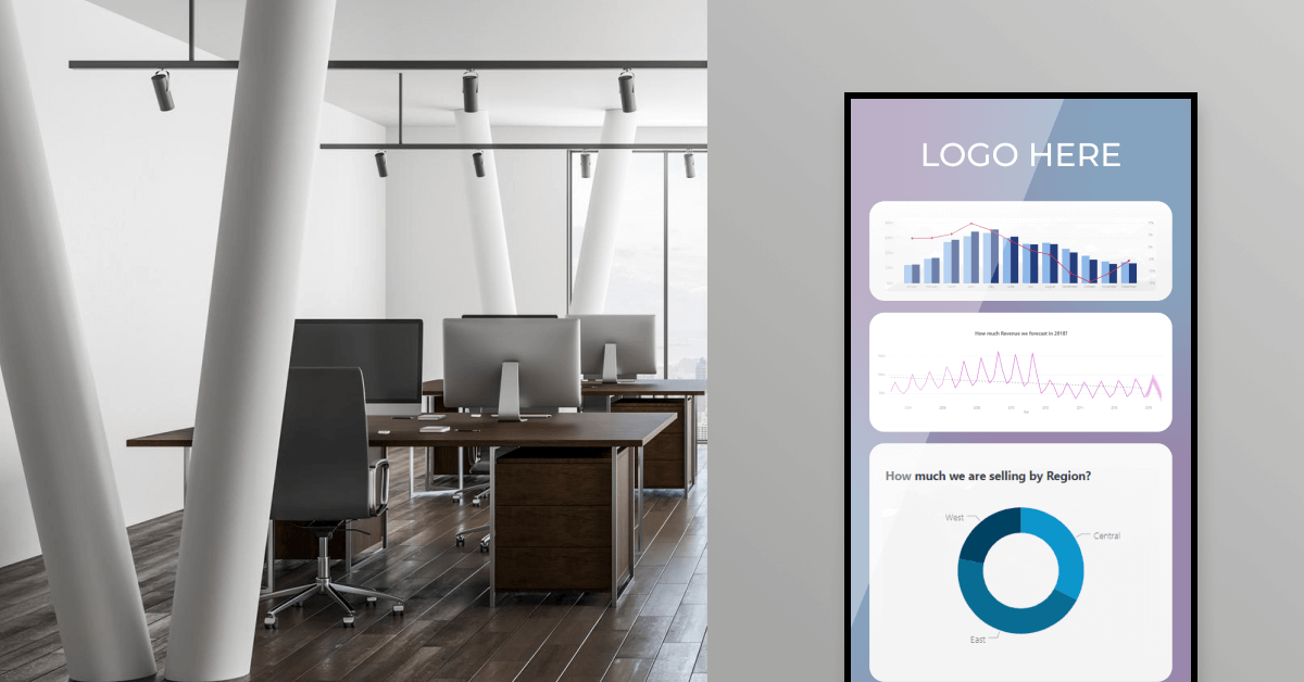
If you’ve built a business intelligence dashboard and watched it gather dust, you’re not alone. Most BI dashboards live in a browser tab nobody opens. The data is current, the visualizations are clean, the KPIs map to real goals. The people who should be acting on them rarely look.
This is the visibility problem at the heart of business intelligence. A dashboard answers questions the team has to remember to ask. A TV dashboard display answers them before anyone thinks to ask.
This article covers 12 real BI dashboard examples by team, the tools companies build them with, design rules for displaying dashboards on shared screens, and the practical setup behind getting your KPIs in front of every person who needs them.
What is a business intelligence dashboard?
A business intelligence dashboard is a visual interface that pulls data from multiple sources and shows KPIs, metrics, and trends in real time on a single screen. It collects information from databases, spreadsheets, cloud services, and SaaS tools, then displays it as charts, graphs, tables, and maps.
Unlike a static report, the data refreshes automatically as the underlying numbers change. The visualization lets people spot patterns and respond to changes as they happen, instead of waiting for a weekly summary built by an analyst.
Most BI dashboards are built in tools like Tableau, Power BI, Looker Studio, or Zoho Analytics. The tool builds the dashboard. What you do with it after that is what determines whether it changes the way the team works.
BI dashboard vs. BI report: what’s the difference?
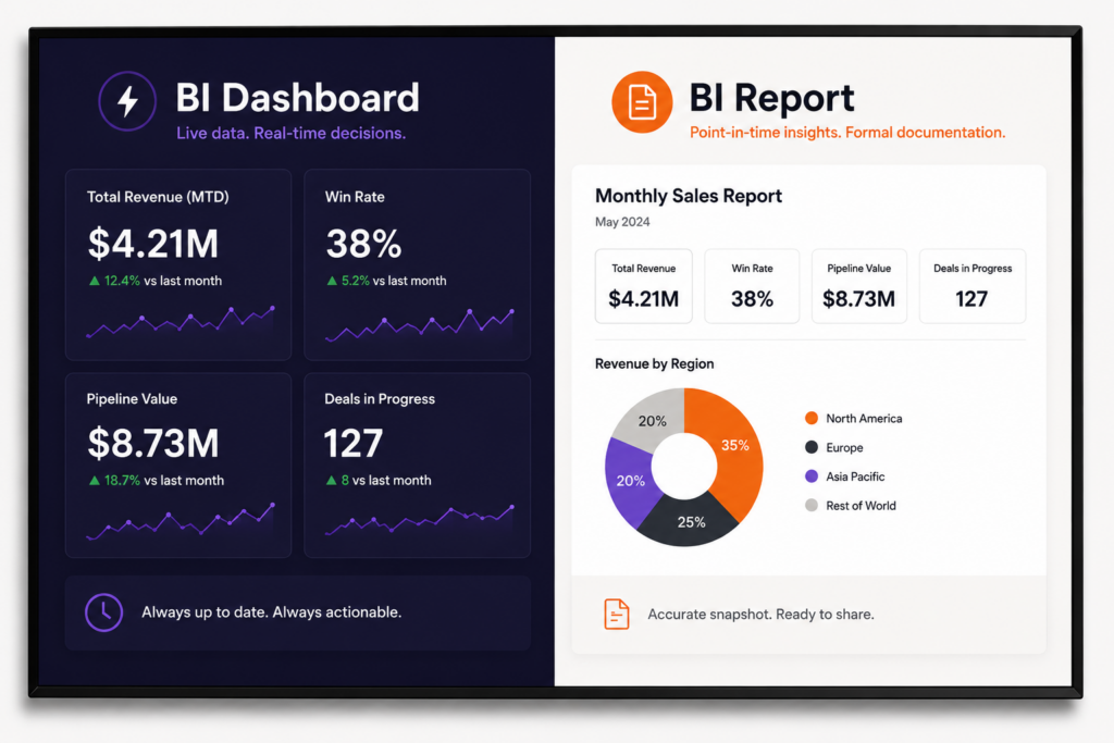
Reports give you a snapshot of what happened. Dashboards show you what’s happening now. Both have a place, but they answer different questions and require different design choices.
| BI dashboard | BI report | |
|---|---|---|
| Update cadence | Real-time or near-real-time | Snapshot at a fixed point |
| Format | Interactive visual | Static document |
| Use case | Monitoring, daily decisions | Formal review, documentation |
| Audience | Active users, ongoing decisions | Stakeholders, periodic review |
When to use a dashboard
You want a dashboard when the team needs to monitor performance and respond to changes during the day or week. Sales pipeline, customer support queues, factory throughput, ad spend pacing all benefit from continuous visibility. A dashboard answers the question: “What’s happening right now, and is it on track?”
When to use a report
A report is the right format for formal documentation: monthly board reviews, quarterly investor updates, year-end audits. Reports capture a moment in time and provide narrative context. They lock in the story. Dashboards keep updating it. Most teams need both.
12 business intelligence dashboard examples by team
Every team builds its own dashboard around the decisions it makes. Below are 12 of the most common examples, what each tracks, and where each is most useful when displayed on a screen.
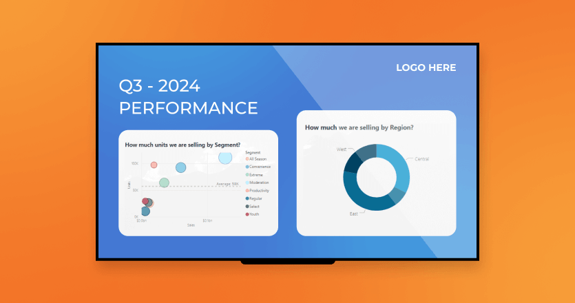
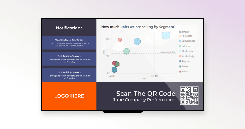
A sales dashboard tracks pipeline value, win rate, deal velocity, and quota attainment in one view. It answers “are we going to hit our number this quarter, and where are we losing deals?” Sales teams typically display it on a screen in the bullpen so reps can see live pipeline movement and recent closed-won bookings without checking their CRM.
A marketing dashboard pulls campaign spend, return on ad spend (ROAS), conversion rate, and marketing-sourced pipeline into a single view. It answers “which channels are working, and where should we shift budget?” Many marketing teams keep this on a screen in the office so daily campaign performance is visible without scheduling a meeting.
A finance dashboard shows cash position, revenue against forecast, accounts receivable aging, and budget variance. It answers “are we on budget, and is cash where we expect it to be?” Because some of this data is sensitive, finance dashboards displayed on screens often use redacted views or restricted-area placement.
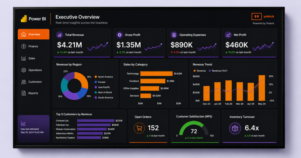
An executive dashboard puts cross-functional KPIs in one place: revenue vs. target, customer satisfaction, headcount, operational uptime. It answers “is the company on track, and what needs attention?” Often displayed in the executive briefing room with daily refresh and threshold alerts for metrics that fall outside acceptable ranges.
An HR dashboard tracks headcount, turnover, time-to-hire, engagement scores, and diversity metrics. It answers “where are we losing people, and how long does it take to fill open roles?” HR teams use these on screens inside HR offices, not always in shared spaces given the sensitivity of the data.
An ops or IT dashboard tracks uptime, SLA compliance, ticket backlog, and resource utilization. It answers “is the system healthy and are we keeping our service commitments?” Often shown in a network operations center on a wall display, refreshed every few seconds, with red threshold alerts for active incidents.
A customer success dashboard tracks NPS, churn rate, product adoption, support ticket volume, and renewal pipeline. It answers “which customers are at risk and where are we expanding?” CS teams display it in their work area to keep at-risk accounts top of mind during the workday.
A supply chain dashboard shows inventory by SKU, on-time delivery rate, supplier performance, and warehouse capacity utilization. It answers “where are the bottlenecks, and what’s at risk of running out?” Common on screens in warehouses and distribution centers where logistics teams act on the data directly.
A manufacturing dashboard tracks throughput, defect rate, downtime, overall equipment effectiveness (OEE), and safety incidents. It answers “is the line meeting target, and what’s slowing us down?” Shop-floor displays are the standard setup for these. See Yodeck’s manufacturing KPI dashboards page for examples.
A project dashboard shows status, budget vs. actual spend, milestone completion, resource allocation, and risk indicators. It answers “which projects are at risk, and where are we over or under budget?” PMOs often run these in shared workspaces so blockers gain visibility outside the weekly status meeting.
A call center dashboard displays live call volume, average handle time, queue wait times, and CSAT. It answers “how is the team handling load right now?” Almost always on a wall display on the call center floor. Agents respond in real time when the queue spikes.
A retail store dashboard tracks daily sales, conversion rate, footfall, and inventory levels by location. It answers “how is the store performing today, and which products are running low?” Many retailers run these in back-of-house areas so store managers can react during shifts.
For every team, the process is effortless. Sign up for free and start using dashboards on screens today.
No credit card required
Business intelligence dashboard tools: How the major options compare
The BI dashboard market is dominated by a handful of platforms. Each is strong at different things, and most companies end up using more than one.
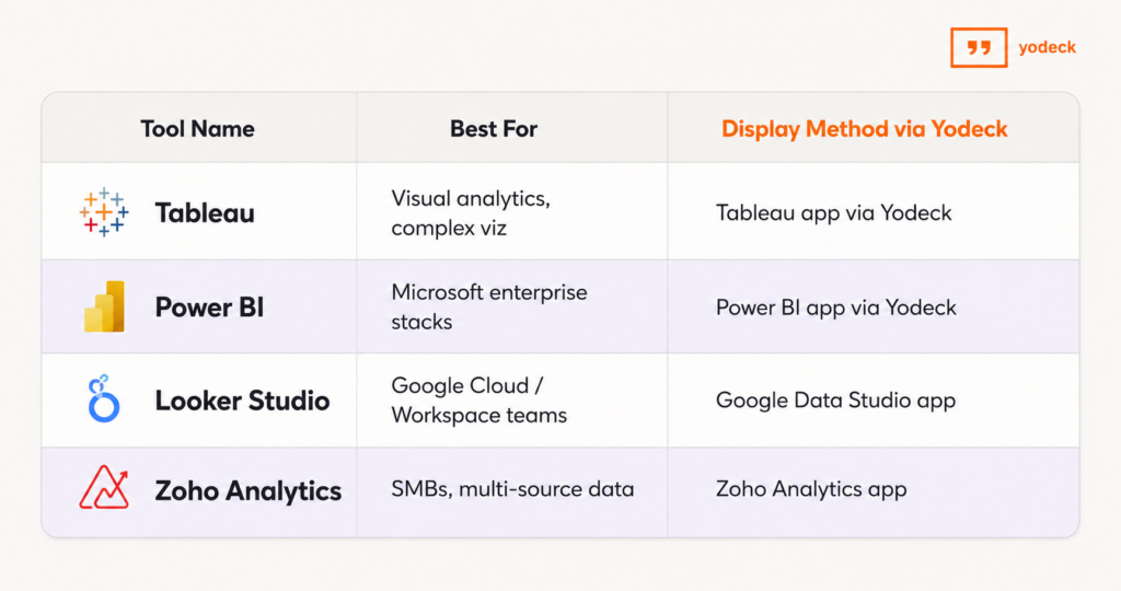
- Tableau (Salesforce) is strong on visual storytelling and complex analytics. Used heavily by analysts and data teams. Tableau dashboards display on screens through Yodeck’s Tableau app integration.
- Power BI (Microsoft) is the most widely used BI tool in enterprise environments, with tight integration into the Microsoft 365 stack. Yodeck’s Power BI app supports Service Principal authentication with row-level security, so Power BI dashboards display on shared screens without compromising data access controls.
- Looker Studio (Google), formerly Google Data Studio, is a strong fit for teams already on Google Cloud, BigQuery, or Google Workspace. Free and browser-based, it works with Yodeck through the Google Data Studio app.
- Zoho Analytics is a cost-effective option for SMBs, with a wide range of connectors. Integrates with Yodeck through the Zoho Analytics app.
💡 Pro tip by Yodeck Team
You don’t have to standardize on one BI tool to display dashboards consistently across screens. Yodeck can rotate a Tableau dashboard, a Power BI dashboard, and a Looker Studio dashboard on the same screen, on a schedule you set.
Which dashboard fits your team? A real comparison
The dashboard that works depends on the team, the decisions they make, and where the team spends their day. Use the table below as a starting point. The ideal screen placement column matters as much as the KPIs themselves. A dashboard built for a sales floor display needs different design choices than one designed for an executive briefing room.
Dashboard: Sales
Primary audience: Sales managers, reps
Top KPIs: Pipeline value, win rate, quota attainment
Refresh cadence: Real-time to daily
Ideal screen placement: Sales floor wall
Sales dashboards help teams track performance, monitor pipeline health, and stay aligned on revenue goals. Real-time visibility keeps reps motivated and helps managers quickly identify opportunities and bottlenecks.
Dashboard: Marketing
Primary audience: CMOs, campaign managers
Top KPIs: ROAS, CAC, conversion rate
Refresh cadence: Daily
Ideal screen placement: Marketing team area
Marketing dashboards provide visibility into campaign performance and marketing ROI. Teams use them to optimize campaigns, monitor conversions, and improve acquisition efficiency.
Dashboard: Finance
Primary audience: CFOs, controllers
Top KPIs: Revenue, cash runway, AR aging
Refresh cadence: Daily for cash metrics, monthly for close
Ideal screen placement: Finance area or executive room
Finance dashboards give teams a clear view of financial performance and cash flow. They support faster decision-making and improve visibility into revenue and receivables.
Dashboard: Executive
Primary audience: C-suite executives
Top KPIs: Cross-functional business KPIs
Refresh cadence: Daily
Ideal screen placement: Executive briefing room
Executive dashboards combine key metrics from multiple departments into one high-level view. They help leadership teams monitor company performance and make strategic decisions.
Dashboard: HR
Primary audience: CHROs, HR partners
Top KPIs: Headcount, turnover, time-to-hire
Refresh cadence: Weekly
Ideal screen placement: HR offices
HR dashboards help teams monitor workforce trends, hiring progress, and employee retention. They support better staffing and talent management decisions.
Dashboard: Operations / IT
Primary audience: COOs, IT managers
Top KPIs: Uptime, SLA compliance, backlog
Refresh cadence: Real-time
Ideal screen placement: NOC or ops room wall
Operations and IT dashboards provide live visibility into systems and service performance. Real-time monitoring helps teams respond quickly to issues and maintain reliability.
Dashboard: Customer Success
Primary audience: CS managers, reps
Top KPIs: NPS, churn, adoption
Refresh cadence: Daily
Ideal screen placement: Customer success team area
Customer success dashboards track customer satisfaction, retention, and product usage. They help teams identify risks early and improve customer relationships.
Dashboard: Manufacturing
Primary audience: Plant managers, line workers
Top KPIs: OEE, throughput, defect rate
Refresh cadence: Real-time
Ideal screen placement: Shop floor display
Manufacturing dashboards give production teams real-time insight into efficiency and quality. They help reduce downtime and improve operational performance.
Dashboard: Retail Store
Primary audience: Store managers
Top KPIs: Daily sales, conversion, footfall
Refresh cadence: Hourly
Ideal screen placement: Back-of-house area
Retail dashboards help managers monitor store performance and customer traffic throughout the day. Hourly updates support faster operational decisions.
Dashboard: Call Center
Primary audience: Floor managers, agents
Top KPIs: Queue depth, AHT, CSAT
Refresh cadence: Real-time
Ideal screen placement: Call center floor wall
Call center dashboards provide live visibility into support operations and customer service metrics. They help teams improve response times and service quality.
H2: BI dashboard design best practices for screens, not laptops
A dashboard built for a 14-inch laptop fails on a 55-inch wall TV. Design choices change when the screen is 10 feet away and nobody touches it.
- Design for distance and glanceability
The 10-foot rule applies: every 10 feet of viewing distance needs about 1 inch of letter height to stay readable. A KPI in a tiny font in the corner of a laptop dashboard becomes invisible on a wall display. Increase font sizes, simplify the layout, and limit each screen to five to seven KPIs maximum.
- Build for no-touch viewing
On a laptop dashboard, filters and drill-downs are part of the value. On a wall display, nobody touches the screen. The dashboard has to communicate everything in its default state. Pre-filter the view, remove interactive controls, and design for the version of the dashboard the team will actually see most of the time.
- Refresh rates and live data
Wall dashboards do not need to refresh every second, but they cannot lag a day behind reality either. Match the refresh rate to the decision cadence: real-time for ops and call centers, hourly for retail and marketing, daily for finance and HR. Yodeck’s working hours scheduling lets you turn screens off when nobody is around.
- One screen, one dashboard
Resist the urge to cram three dashboards onto one TV. A single dashboard, big and clear, reads from across the room. Three small dashboards on the same screen read as wallpaper. If you need to show more, rotate dashboards on a schedule instead of fitting them all at once.
💡 A trap nobody warns you about
A web-based dashboard left open in a browser tab for 24 hours straight starts to lag, freeze, or display stale data. Memory leaks build up, sessions time out, the tab quietly dies. The screen still looks fine to anyone walking past, but the numbers have not actually moved since yesterday. The fix is to schedule a hard refresh of the dashboard URL every four to six hours, separate from the BI tool’s own internal polling. Most teams learn this the hard way, usually after a stakeholder notices the same number on the wall every morning for a week.
How to create a business intelligence dashboard in 6 steps
Building a useful BI dashboard is less about the tool you pick and more about the decisions you make before you open it.
| 1. Define the audience and the decisions. Who will look at this dashboard, and what do they need to act on? A dashboard for everyone is a dashboard for no one. |
| 2. Identify your data sources. CRM, ERP, ad platforms, spreadsheets, cloud storage. Most dashboards pull from at least three. |
| 3. Clean and prepare the data. Inconsistent column names, duplicate rows, and missing fields will undermine the dashboard before you start visualizing. |
| 4. Pick the right tool. Tableau, Power BI, Looker Studio, or Zoho Analytics. Match the choice to your stack and your team’s skill level. |
| 5. Design for the audience, not the data. Place the most important key performance indicators at the top-left. Use white space. Limit colors. Avoid clutter. |
| 6. Test, share, and iterate. Watch how people use it. Update what they ignore. The first version is rarely the final version. |
If the dashboard is going on a screen, add a seventh step: redesign for the screen using the best practices in the previous section.
Common challenges when building BI dashboards
The hard part of BI dashboards is rarely the visualization. It’s the data.
How to display BI dashboards on every screen in your office
Once the dashboard is built, the question is who sees it. The data lives in your BI tool. The visibility lives on the screens your team walks past.
A dashboard you have to open is a dashboard your team usually doesn’t. The fastest way to change behavior is to make the data ambient. Put the right dashboard on the right screen in the right physical space, and people start reacting to changes they would otherwise miss.
Office TVs and wall displays
The most common setup is a wall-mounted TV in the open office, the team area, or the lobby running a rotation of dashboards relevant to the people who pass it. Marketing dashboards in the marketing area. Sales dashboards on the sales floor. Yodeck’s office digital signage covers this, and the same approach works whether the dashboard comes from Power BI, Tableau, Looker Studio, or another tool.
💡 Visma, a SaaS company with offices across Europe, uses Yodeck to display real-time KPIs on screens for team alignment. The full setup is in the Visma case study.
Factory floors and deskless workers
Most BI dashboards never reach the people who run the operation. The shop floor, the warehouse, the distribution center, the clinic floor. These workers do not sit at a desk and do not check email. In the US alone, the frontline workforce, roughly 100 million people who make, move, sell, and serve, is the largest segment of the economy and the least digitally equipped, according to McKinsey. A BI dashboard helps these teams only if it lives on a screen they pass during a shift.
💡 Swissport, the aviation services company operating across 300+ airports, uses Yodeck to put safety and operational information in front of 60,000 deskless workers across its sites. The full story is in the Swissport case study.
Retail floors, healthcare clinics, and customer-facing screens
Some dashboards belong in front of customers, not just staff. A retail store can show inventory levels or promotions to shoppers. A clinic can show wait times in the lobby. Customer-facing dashboards need cleaner design and tighter editorial control than internal ones. Pre-build views, lock the layout, and use ready-made dashboard templates to keep brand consistency.
Which BI tools work with Yodeck?
Power BI, Tableau, Looker Studio (Google Data Studio), Zoho Analytics, SmartSheet, Airtable, and more. Yodeck has dedicated digital signage apps for the most common BI and analytics tools, plus integrations with SharePoint, Microsoft Teams, and Google Drive. You don’t need to change your BI stack to put the dashboards on screens.
A BI dashboard nobody sees is reporting nobody acts on. Getting your dashboards in front of the team, at the right time, in the right physical space, is what turns analytics into operations.
Start free with Yodeck’s digital signage software and bring your existing dashboards to every screen in your office. Connect a TV, link your BI tool, and your team sees what they need to see without opening another tab.
Get Started with Yodeck
Unlock the power of digital signage with our easy, professional and affordable solution.