The layout, typography, pricing and scheduling principles behind menu boards that shorten decision time and lift order value.
Key takeaways
Design for distance: menu text is read standing 6 to 15 feet away, so type size and contrast decide whether the menu works at all
Structure beats decoration: clear zones and visual hierarchy speed up ordering more than any visual effect
Price presentation changes spending: how prices are formatted on the board measurably affects what customers order
Design menu states, not one menu: breakfast, lunch and dinner need their own layouts, scheduled to switch automatically
Motion is seasoning: animation draws the eye to one item, but too much makes the whole board unreadable
A customer at your counter decides what to order in seconds, and your menu board either helps or gets in the way. Good digital menu board design gets the right item into a hungry person’s field of vision fast enough to influence what they buy. Most digital menu boards fail at exactly this: they cram too much on screen, use type that vanishes from ten feet away and treat pricing as an afterthought.
This guide covers the design principles that fix that, from readability standards and layout zones to pricing psychology and daypart scheduling, with before and after examples you can copy.
What makes a digital menu board easy to read?
A digital menu board is easy to read when a customer standing at ordering distance can find a category, an item and a price in under three seconds. Every other design choice builds on that three second test. A board that fails the distance check fails completely, no matter how good the photography is.
Three factors decide readability on a screen.
Type size scaled to viewing distance. Menu boards are read from much farther away than a printed menu. A common sign industry rule of thumb says every inch of letter height buys roughly ten feet of comfortable reading distance. In practice, item names on a board read from 10 to 15 feet should render at around 1.5 inches tall on the physical screen. Design at your screen’s native resolution, then check your work from across the room, not from your desk chair.
Contrast you can measure. “Use good contrast” is the advice every guide gives, and the advice is useless because nobody can check it. Borrow the standard web designers use instead: the W3C’s accessibility guidelines set a minimum contrast ratio of 4.5:1 for normal text and 3:1 for large text. Menu type counts as large text, but treating 4.5:1 as your floor gives you headroom for glare, ambient light and cheap panels. Free contrast checkers test any text and background color pair in seconds, which turns a vague design opinion into a pass or fail check.
Font selection. Sans serif typefaces hold up better at distance and on lower quality panels. Decorative and script fonts belong in your logo, not in your item names. Two typefaces per board is the working maximum: one for headers, one for items and prices. The same discipline applies to weights. If everything is bold, nothing is.
Interesting insight: most menu boards are designed on a laptop two feet from the designer’s face, then read by customers from 12 feet away in a bright room. That gap explains more bad menu boards than any lack of design talent. The fix costs nothing: preview every design at actual size and actual distance before it goes live.
The rest of this article works through the full design process: layout and hierarchy, pricing presentation, motion, menu scheduling, content requirements and worked examples, ending with the tools that turn the design into a live board.
How do you design a digital menu board?
Designing a digital menu board is a five step process: audit your menu, choose your screen orientation, define layout zones, apply visual hierarchy, then build separate menu states for different times of day. Skipping the early steps is why so many boards end up as a spreadsheet dumped onto a TV.
- Audit your menu first. Decide what earns screen space before you open a design tool. Rank items by margin and popularity, then cut or demote the bottom of the list. A digital menu board is prime real estate, and every low margin item on it is displacing a high margin one.
- Choose orientation deliberately. Landscape suits wide counters and multi-screen banks. Portrait suits narrow spaces, entrance displays and drink menus. If you run both, never mount them side by side, and design separate layouts for each rather than stretching one to fit.
- Define your zones. Divide the screen into fixed regions before placing a single item: category headers, item lists, a promo panel, an imagery zone. Zones keep the board organized as the menu changes, because new items drop into an existing structure instead of reshuffling the whole design.
- Apply hierarchy inside each zone. Category names largest, item names next, descriptions and prices smaller. One glance should reveal the structure: what sections exist, what is in them and what things cost.
- Build menu states. Your breakfast menu and your dinner menu are different products. Design them as separate layouts from the start, which the scheduling section below covers in detail.
How does designing for a screen differ from designing a printed board? The comparison matters because most operators carry print habits onto screens.
| Design constraint | Print menu board design | Digital menu board design |
|---|---|---|
| Updating prices or items | Reprint and reinstall, so menus stay wrong for weeks | Edit once, screens update in minutes |
| Time of day | One static menu covers all dayparts | Separate breakfast, lunch and dinner states switch on schedule |
| Drawing attention | Position and size only | Motion, rotation and scheduled promos |
| Compliance changes | Reprint every board | Update calorie data once, push everywhere |
| Design discipline needed | Forced by print costs | Nothing stops you from cramming, so structure is on you |
The same logic applies whether you run a cafe, a food truck or a chain: restaurant menu board design and cafe menu board design differ in tone and content, not in these fundamentals.
Layout and visual hierarchy principles
Layout decides where the customer’s eye lands, and hierarchy decides what the eye understands when it gets there. These principles apply to every format, from a single cafe screen to a three panel drive-thru bank.
Zone your screen before placing anything
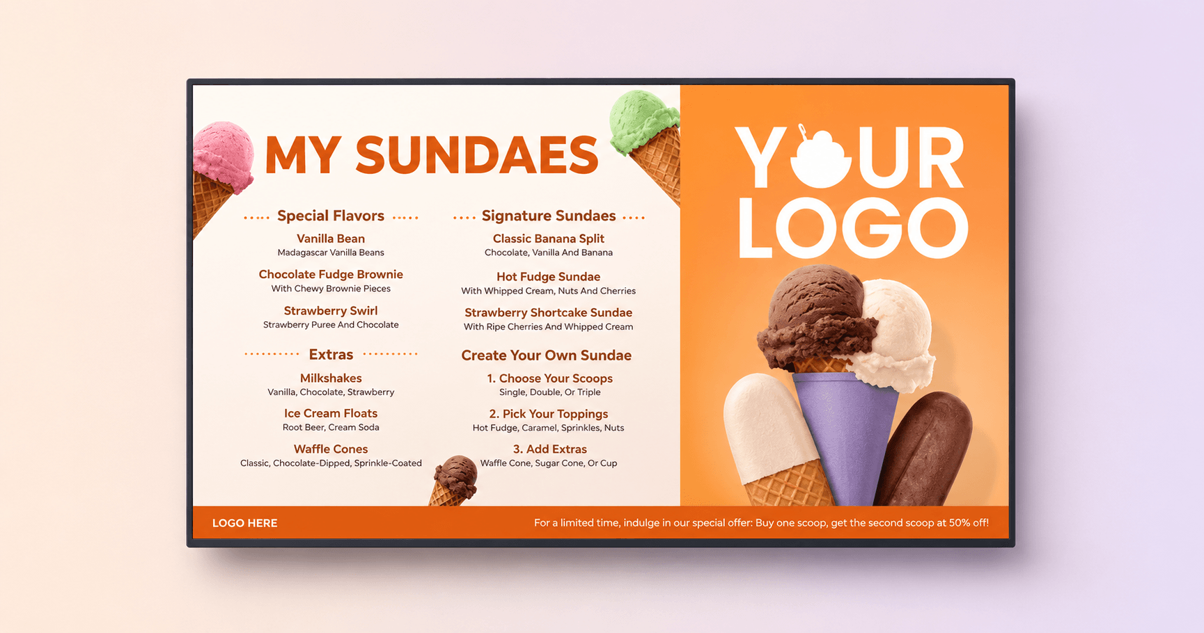
A zoned layout assigns every element a fixed home: categories along the top or left, items in the main field, promotions in a dedicated panel. The payoff is consistency. Regulars learn where things live, staff answer fewer questions and menu updates stop turning into redesigns. Color coded category zones also do quiet navigational work: a customer scanning for drinks finds the blue zone without reading a single header.
Brand colors belong here too, applied to zones and headers rather than body text. McDonald’s red and yellow or Subway’s green work because they frame the menu, not because every item name is printed in them. Keep item text in high contrast neutrals and let the brand palette live in the structure.
Balance images and text
Food photography sells, but only when the photo has room to work. One strong image per category beats a thumbnail next to every item. Every photo must earn its space: high resolution, consistent lighting and style across the board and honest to what the kitchen actually serves. A single stretched or pixelated image reads as neglect, and customers extend that judgment to the food.
The working ratio for most boards is roughly two thirds text and structure, one third imagery. Drive-thru and fast food menu board design pushes further toward text, because decision speed matters more than appetite appeal when there is a car idling behind you.
Limit item count per screen
Fewer items per screen means faster decisions and a shorter line. If your menu will not fit at readable type sizes, that is the screen telling you to split content across a second screen, rotate categories on a schedule or cut items. Shrinking the font to fit everything is the one option that is always wrong. Item count is where digital menu board graphic design differs most from print habits: the screen count is a design variable, not a fixed constraint.
Curious how these choices play out on a real menu? You can book a quick demo and walk through a working board with a Yodeck expert.
Pricing design that protects order value
How prices look on your board changes how much customers spend, and the effect is measurable. Pricing presentation is the cheapest design lever you have, because changing a price format costs nothing and touches every transaction.
The best documented effect is currency symbol removal. Researchers at Cornell University found that diners spent about 8 percent more when menu prices appeared as plain numerals with no dollar sign. For a board that thousands of customers read every week, that is a one time design edit with a recurring payoff. The researchers attribute the effect to the “pain of paying”: currency symbols remind people they are spending money, and plain numerals soften that signal.
Three more pricing presentation rules earn their place on a digital board:
price size stays a step below the item name, so customers evaluate the item before the cost
prices sit directly after the item name, never in a right aligned column connected by dot leaders, which invites price comparison shopping down the column
charm pricing (9.49 instead of 9.50) still works in quick service settings, though rounded prices can suit premium positioning better
Domino’s Pizza applies the promotional side of this thinking across its Greek network of 34 outlets and more than 40 points of sale. Takeaway customers spend only a few minutes in store, so Domino’s uses Yodeck to fill that window with centrally managed menu boards and offer displays. The screens replaced a flash drive setup that each store previously had to update by hand.
Using motion without killing readability
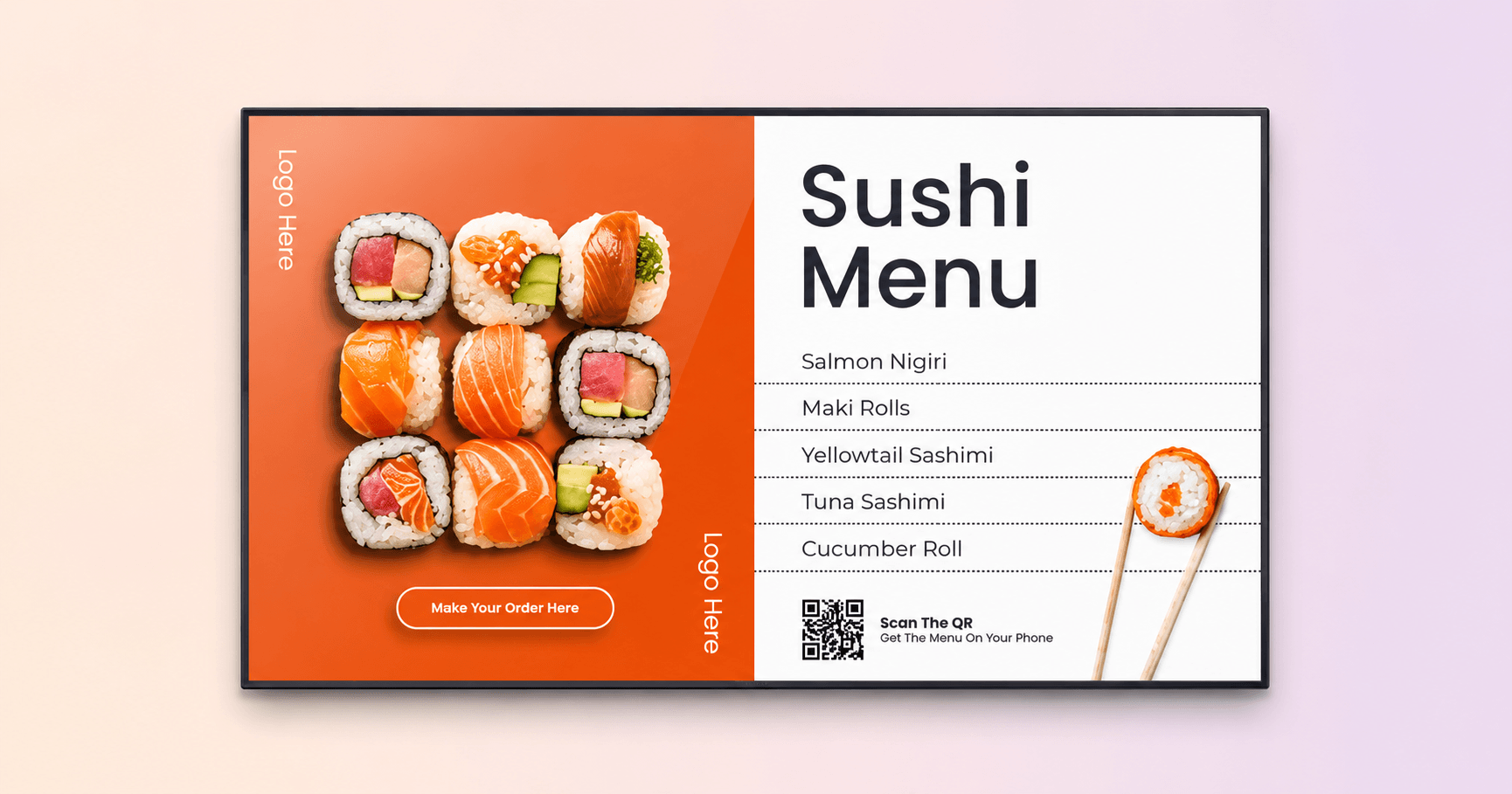
Motion is the one capability print can never match, and the fastest way to ruin a digital board. The rule that reconciles both: one moving element per screen, and never the menu itself.
Animation works as a spotlight. A gentle loop on the promo panel, steam rising off a coffee in the imagery zone or a rotating limited time offer all pull the eye exactly where you want it. The moment two elements move at once, they compete, and the customer’s eye bounces between them instead of reading the menu. Item names and prices stay static, always. A customer halfway through reading a price that slides away will not start over, they will just feel rushed.
Rotation timing follows the same logic. If your board cycles between slides, each slide needs to stay up long enough to be read comfortably from the back of the line, which in practice means 10 seconds as a floor for anything with more than a headline on it. Full motion video earns a dedicated screen or a scheduled slot, not a permanent corner of the menu, and ads for partner brands never interrupt the menu a customer is actively reading.
Design menu states, not a single menu
The biggest structural mistake in digital menu board design is designing one menu when your business serves several. A cafe at 7.30AM and the same cafe at 2PM are different businesses with different bestsellers, and their menu boards should reflect that.
Dayparting, meaning the practice of scheduling different content for different times of day, is a design decision first and a software feature second. Each menu state deserves its own layout choices. Breakfast boards front load coffee and grab-and-go items with larger type for a queue that moves fast. Lunch boards give combos and bundles the promo zone. Evening boards can slow down, with richer imagery and space for higher margin items. Designing states also removes the worst compromise of single menu thinking, which is the all day menu that lists breakfast items nobody can order at 6PM.
The scheduling itself is the easy part. Build each state as a separate layout, assign each one a time window and the screens switch automatically, every day, with no staff involvement.
Pro tip by Yodeck Team: build your daypart menus as separate layouts and schedule each one to its own time window in Yodeck. Screens switch from the breakfast to the lunch state on the minute, across every location at once, and nobody has to remember to do it.
What content belongs on a digital menu board?
A digital menu board carries four content types: menu items with prices, category structure, one promotional zone and any legally required information. Everything else is noise competing with the sale.
The legal layer is the one most design guides skip. In the US, the FDA’s menu labeling rule requires restaurants that are part of a chain with 20 or more locations operating under the same name to declare calories for standard items directly on menus and menu boards, alongside a statement that 2,000 calories a day is used for general nutrition advice. If that describes your business, calorie declarations are a design input from day one, not a retrofit: calorie text needs its own type style, sized to stay legible without competing with prices.
Franchise operators below the threshold should treat the rule as a preview, since voluntary calorie display is increasingly common and customers have learned to expect it.
Dietary icons earn their space in almost every concept. Small, consistent markers for vegetarian, vegan and gluten free items let customers self serve answers that would otherwise cost your counter staff a conversation per order. Build the icon set once, apply it everywhere and put a small legend in a corner of the board.
Two things do not belong on the menu board itself. Long item descriptions are for printed menus and websites, since on a board every item over one line of description is stealing type size from the whole layout. And content that deserves interaction, such as full nutrition tables, allergen detail or build-your-own flows, belongs on interactive menu boards where a customer can explore it at their own pace without holding up the line. If you are weighing the investment against the returns, our breakdown of digital signage costs covers what a menu board setup actually runs.
Digital menu board design examples: before and after
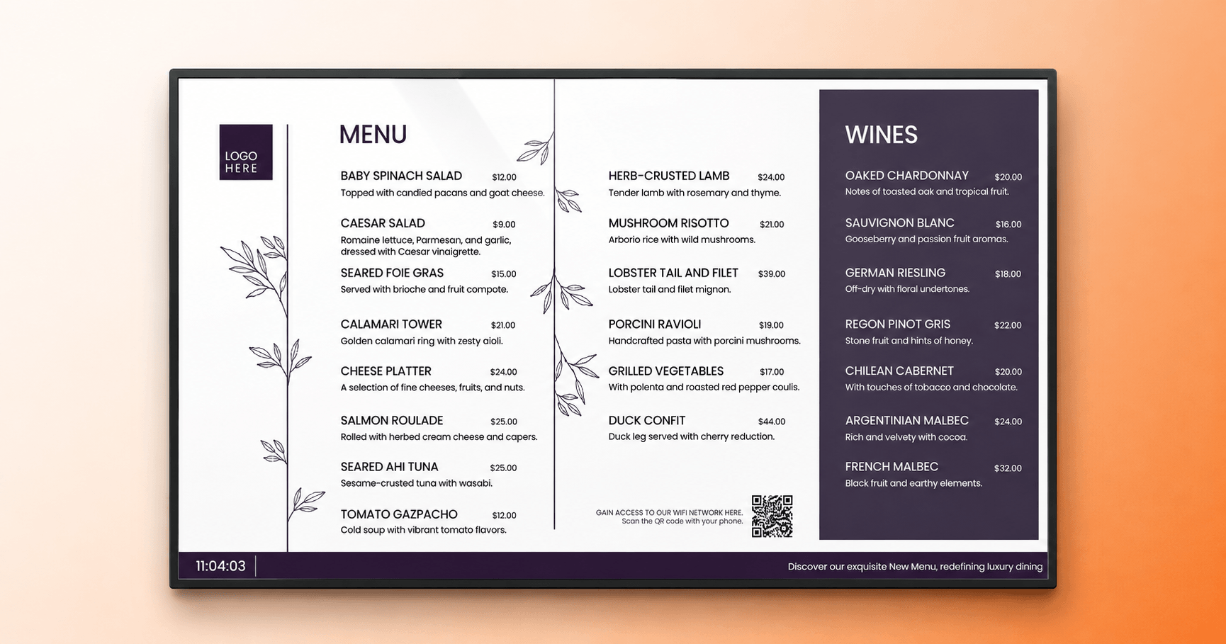
Principles stick better when you can see them applied, so here are three worked digital menu board designs, each fixing a failure pattern from earlier sections. The best digital menu designs are rarely dramatic redesigns. Most of the wins come from structure: fewer items, clearer zones and type that survives the distance test.
Cafe board: the distance test fix. The before state is the classic cafe failure, an all day menu of 40 items in 14 point type with the espresso machine blocking the bottom third. The after state cuts to 24 items across two daypart states, moves categories into color coded zones and doubles the item name size. Nothing about the brand changed. The menu just became readable from the door instead of from the register.
QSR board: the hierarchy fix. The before state gives every burger equal billing in a uniform grid, so the customer’s eye has nowhere to land. The after state promotes two high margin combos into a featured zone with photography, drops the remaining items into a compact text list and moves prices to sit tight against item names with no dot leaders. Fast food menu board design done properly steers the undecided toward the items you want to sell.
Drive-thru board: the speed fix. The before state reuses the indoor menu outdoors, where sun glare and five second decision windows destroy it. The after state strips to combos plus bestsellers, pushes contrast well past the 4.5:1 floor for direct sunlight and locks all motion except a single rotating offer panel timed to the average queue wait. Fewer choices, presented bigger, is the whole design.
If you want a wider gallery of layouts to react to before committing to a direction, browse these digital menu board ideas and bring the structure principles from this guide with you.
Common digital menu board design mistakes
Most menu board failures come from the same short list of mistakes, and every one of them is cheap to fix. Restaurant owner forums repeat them with striking consistency.
Cramming the full menu onto one screen. The most common failure. If the menu does not fit at readable sizes, the menu needs editing or the content needs a second screen, not a smaller font
Designing at arm’s length. Boards approved on a laptop screen and never checked from ordering distance. Preview at real size, from real distance, in real lighting
Letting ads interrupt the menu. A customer mid-decision who watches the menu vanish behind a promo does not wait for it to come back. Promotions get their own zone or their own screen
Constant layout churn. Regulars order faster because they know where things live. Change items and prices freely, change the structure rarely
Out of stock items left on screen. Every 86’d item still displayed is a guaranteed bad interaction at the counter. Digital boards remove this excuse entirely, since pulling an item takes seconds
One menu, all day. Covered above, and worth repeating because this mistake caps revenue quietly: the 7AM customer and the 7PM customer are seeing the wrong menu at least once
How to build your digital menu board design
Once the design thinking is done, the build is the quick part. Yodeck is a digital signage software platform used across restaurants and QSRs, and it covers the pieces this guide describes.
- Menu focused layouts sit among 700+ free templates.
- The Layout Editor includes alignment guides and an in-editor template gallery for fast structure changes.
- Scheduling switches daypart states automatically across every screen and location.
- The free digital menu board templates collection is the fastest way to start from a zoned structure instead of a blank canvas, and a Canva integration means existing brand assets drop straight in.
For multi location operators, digital signage for restaurants centralizes the whole thing: one design system, pushed everywhere, updated from one dashboard. Domino’s runs exactly that setup across its network, on the same platform that holds a 4.7 out of 5 rating across 3,000+ verified reviews on G2, where Yodeck is a G2 Leader with 20 Spring 2026 badges.
Good digital menu board design pays for itself in shorter lines, fewer questions at the counter and better placement for the items you actually want to sell. The principles in this guide are the expensive part, and they are free. The screen time is cheap: your first screen costs nothing, forever, and your first sign-up includes 30 days of unlimited feature access for up to five screens.
Create your first digital menu board free with Yodeck.
Start for free