


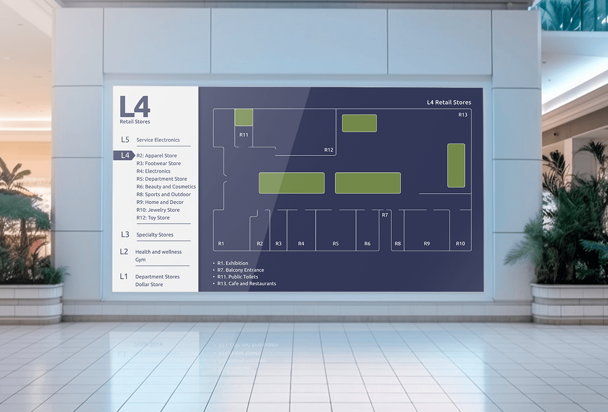
What directional signage is, how it fits with the other three wayfinding sign types, what it looks like in offices, campuses, events and venues, and when a screen does the job better than a printed arrow.
Key Takeaways
Every building has a spot where visitors stop, look around and pull out their phone. Directional signage exists to remove that moment: a sign at the exact place where someone has to choose, telling them which way to go, so they reach the room without asking anyone. Done well, nobody notices it. Done badly, your reception desk becomes an information desk. This guide covers what directional signage is, how it differs from the other wayfinding sign types, what it looks like in different environments, what US accessibility rules require, and when digital wayfinding signage is the better choice.
What is directional signage?
Directional signage is any sign that tells people which way to go to reach a destination. A directional sign pairs an arrow or a route cue with the name of the place, and sits where someone has to choose between two or more ways forward: a lobby, an elevator landing, a corridor junction, a parking lot exit. Directional signs are one part of a wider wayfinding signage system. They do not identify a place, explain rules or describe a facility. They point.
The simplest directional sign is an arrow with the word “Reception” on a wall. More developed examples include a directory at the entrance of a multi-tenant building, overhead corridor signs in a university, floor graphics that lead to a vaccination room, or a screen at an event entrance that shows which hall each session is in. Whatever the format, the job is the same: get the person from where they are to where they are going with no detours.
This article covers the four wayfinding sign types and how directional signs fit among them, examples by environment, the indoor and outdoor split, US accessibility requirements, the decision between digital and static, and how to plan the system as a whole.
What are the four types of wayfinding signage?
Wayfinding signage comes in four types: identification, directional, informational and regulatory. Each answers a different question, and a building needs all four for the directional signs to work. An arrow to “Suite 400” is useless if Suite 400 has no sign on its door.
| Type | Question it answers | Where it sits | Examples |
|---|---|---|---|
| Identification | Am I here? | At the destination | Room numbers, department plaques, floor markers, building names |
| Directional | Which way do I go? | At decision points | Arrows, corridor signs, directories, floor graphics, exit route signs |
| Informational | What do I need to know? | Where people pause | Floor maps, opening hours, facility directories, “you are here” maps |
| Regulatory | What am I allowed to do? | At the boundary of a rule | No entry, staff only, occupancy limits, accessible route markers |
Most wayfinding failures come from a gap between types rather than a weak sign. A visitor follows directional arrows to the third floor, steps out of the elevator and finds no identification sign confirming they are on the right floor, so they turn back. The fix in that case is a floor marker, not a bigger arrow. Treat the four types as one system and audit them together.
A hospital is the clearest case of all four working at once: directories at every entrance, arrows at every junction, department signs at every door and regulatory signs at every restricted area. If that is your setting, the hospital wayfinding signage page covers the specifics.
Directional vs wayfinding signage: what is the difference?
Wayfinding signage is the whole system that helps people navigate a space. Directional signage is the part of that system that points the way. Every directional sign is a wayfinding sign, but a room plaque, a floor map or a “staff only” notice is wayfinding signage without being directional.
In practice, people use the two terms interchangeably, and search engines treat them as one topic. The distinction matters when you plan or audit a building. If you only buy directional signs, you have arrows without destinations. If you only buy identification signs, you have destinations nobody can find. Wayfinding is the plan, and directional signage is one of its four outputs.
Examples of directional signage by environment
The best directional signage looks different in an office, a campus, an event hall and a stadium, because the visitor, the route and the rate of change are different in each. The examples below cover the five environments where directional signs do the most work.
Office directional signs and building directories
Office directional signs do two jobs: get visitors from the entrance to the right desk, and get employees from the elevator to the right meeting room in a building they only half know. The core pieces are a lobby directory listing tenants or departments by floor, elevator landing signs with floor numbers and arrows to the main areas, corridor signs at every junction, and small arrow signs for restrooms, exits and kitchens.
Directional signs for office buildings change more often than people expect. A tenant leaves, two departments merge, half the meeting rooms get renamed after a reorganization, and the printed lobby directory lags behind every one of those changes. A digital building directory on a lobby screen updates from a dashboard in minutes, and the same screen can show visitor instructions, a welcome message for a scheduled guest or the day’s room bookings.
Campus and school wayfinding signage
Campus wayfinding has a problem offices do not: the destination is often another building, outdoors, hundreds of meters away. Directional signage on a campus starts at the parking lot and the main entrances with large exterior map boards and pylon signs, continues with directional posts at every path junction, and finishes inside each building with floor directories and corridor signs.
Universities add a second layer: events. Orientation week, open days, exam periods and conferences all bring people who have never set foot on the campus, and each event changes which rooms matter. University wayfinding screens in building entrances handle that layer, showing today’s lectures by room, exam locations and temporary closures, while the permanent exterior signs carry the routes that never change. Schools have a smaller version of the same need, especially for parents at pickup, open evenings and performances, which the school wayfinding signage page covers.
Directional signage for events
Directional signage for events is temporary, changes by the hour and serves people who have never been in the venue. That rules out most permanent signage. The usual kit is freestanding entrance signs, directional arrows at every corridor and hall entrance, session or stage signs at each room and floor graphics for registration queues.
The hard part is the schedule. A session moves from Hall B to Hall C an hour before it starts, and a printed sign cannot follow it. Screens at the entrances and junctions can show the live agenda by room and reroute attendees the moment something changes, and the same screens carry sponsor content between updates. The directional signage for events page goes into the setup for conferences, trade shows and festivals.
Venue and stadium wayfinding
Stadiums, arenas and theaters move tens of thousands of people through the same corridors in a short window, twice: on the way in and on the way out. Directional signage in these venues is mostly about sections, gates and services. Gate numbers and section ranges at every concourse junction, arrows to restrooms and concessions, and exit routes that stay readable in a crowd.
The complication is that the route depends on the event. A concert uses a floor layout that a football match does not, and a sold-out night needs different queue routing than a half-empty one. Stadium wayfinding digital signage on concourse screens switches the section map and the queue directions per event, and switches again at the final whistle to show exits and transport. Museums and cultural venues have a gentler version of the same problem, where museum digital signage routes visitors to temporary exhibitions that change every few months.
Floor and building directional signage
Floor directional signage is the layer that sits between the lobby and the room: the signs at each elevator landing and stairwell exit that tell you which way to turn on this floor. Building directional signage is the layer above it: the directory and the entrance signs that tell you which floor and which wing to head for. Both are easy to neglect because the lobby gets the attention and the budget.
A good test is to stand at each elevator landing and ask whether a first-time visitor could reach any room on that floor without asking. If the answer is no, that landing needs a floor sign with room ranges and arrows. In buildings where floors change tenants or layouts, a screen at each landing does the same job and updates from one place, so the sign on floor 7 is never two tenants out of date.
Interior vs exterior wayfinding signage
Exterior wayfinding signage gets people to the right entrance. Interior wayfinding signage gets them from the entrance to the room. The two are built to different specifications and change at different rates, which is why digital fits one far more often than the other.
| Exterior and outdoor wayfinding signage | Interior wayfinding signage | |
|---|---|---|
| Main job | Route vehicles and pedestrians to the right entrance | Route people from the entrance to a destination |
| Typical formats | Pylon signs, monument signs, directional posts, parking signs, map boards | Directories, corridor signs, door signs, floor graphics, screens |
| Viewing distance | Long, often from a moving vehicle | Short, at walking pace |
| Rate of change | Low, mostly permanent | Medium to high, depends on the building |
| Environmental demands | Weatherproof, readable in sun and at night, vandal resistant | Readable under indoor lighting, non-glare |
| Where digital fits | Entrance screens under cover, outdoor-rated displays at main gates | Lobbies, elevator landings, corridor junctions, event entrances |
What are the ADA requirements for directional signage?
Under the 2010 ADA Standards, directional signs do not need braille or raised characters. Section 216.3 says signs that give direction to, or information about, interior spaces only have to meet section 703.5, the visual character rules. Braille and tactile text are required for signs that identify permanent rooms and for exit door signs, not for the arrows that lead to them. The scoping is in chapter 2 of the ADA Standards, and it is the rule sign vendors most often get wrong.
The 703.5 visual rules still apply, and they are specific:
| Requirement | What 703.5 says | What it means for a screen |
|---|---|---|
| Finish | Non-glare | Matte or anti-glare display, no glossy panel |
| Contrast | Light on dark or dark on light | High-contrast text, no mid-tone text on mid-tone backgrounds |
| Mounting height | Text at least 40 inches above the floor | Keep the lowest line of directional text at or above 40 inches |
| Character height | 5/8 inch minimum at eye level viewed from under 72 inches; 2 inches minimum when mounted 70 to 120 inches high; add 1/8 inch per foot of viewing distance beyond those limits | Size the text to the farthest point a visitor reads from, not to the layout grid |
| Spacing | Stroke, character and line spacing within set ranges | Avoid condensed or display fonts for directional text |
The full table is in chapter 7 of the ADA Standards. Two more things hold regardless of format. Directional signs to accessible means of egress fall under 216.4.3 and are required. And the standard is written around printed signs, so treat its numbers as the minimum for a screen layout and confirm anything beyond that with your accessibility consultant.
💡 Interesting insight: directional screens are often mounted high to be seen over a crowd, which pushes them into the 2 inch and 3 inch minimum character brackets. Check the mounting height before you design the layout, not after.
When should you use digital wayfinding signage?
Use digital wayfinding signage where the route, the audience or the message changes often enough that reprinting is not practical. For a two-story office with the same tenants for a decade, printed directional signs are cheaper and good enough. For a conference venue, a multi-tenant tower, a university or a hospital, the signs are out of date within weeks and the cost moves to the reception desk.
Digital directional signage is a screen, usually in a lobby, at an elevator landing or at a corridor junction, that shows directories, arrows and maps from a central dashboard. The content can be scheduled by time of day, switched per event or updated in minutes from a laptop. The hardware is a commercial display plus a media player, and the same screen can carry announcements, a welcome message or live transport data alongside the directions.
Interactive wayfinding signage and kiosks
Interactive wayfinding signage lets the visitor ask the question instead of reading every answer. A touchscreen directory lets someone search for a name, a department or a room and see the route on a map, which matters in buildings with hundreds of destinations where a static list fails. An interactive kiosk in a lobby, a campus entrance or a hospital atrium handles the questions that would otherwise queue at the desk, starting with “which floor is this department on?”
Interactive screens are the right choice where destinations are many and visitors are new. They are overkill for a corridor junction with three options, where a plain arrow screen or a printed sign does the job faster. A useful rule is that interaction should cut the number of steps to an answer, never add one.
Multi-language and real-time updates
Multi-language wayfinding is where screens have no real static competitor. A printed sign can carry two languages before it gets crowded. A screen can rotate through five, or show the visitor’s language on request, without any change to the hardware. Airports, universities, hospitals and tourist venues all serve audiences where a share of visitors reads English slowly or not at all, and a wrong turn in a hospital has a cost that a wrong turn in a shopping mall does not.
Real-time updates are the second reason to go digital. A closed elevator, a relocated session, a changed gate or an emergency reroute all need the directional signs to change at once, across the building, from one place. Screens connected to a central platform do that in minutes, where printed signs need someone with a ladder and a stack of paper. A QR code on the screen lets a visitor carry the route on their phone, and the destination behind the code can change without touching the screen layout.
Digital vs static directional signage
| Static directional signage | Digital directional signage | |
|---|---|---|
| Best for | Permanent routes, exterior signs, exit routes, small buildings | Lobbies, landings, junctions in buildings that change |
| Update cost | Reprint and reinstall, per sign | Edit once, every screen updates |
| Update speed | Days to weeks | Minutes |
| Languages | One or two before it gets crowded | As many as the audience needs |
| Event and schedule changes | Cannot follow | Switch per event, per day, per hour |
| Emergency rerouting | Fixed, needs separate exit signage | Can override every screen with one alert, alongside required exit signs |
| Upfront cost | Low per sign | Higher per screen |
| Power and connectivity | None needed | Needs both, keeps playing offline if the player caches content |
| Accessibility | Tactile options for identification signs; visual rules for directional | Visual rules apply; design for contrast, size and glare |
Most buildings need both. Static signs carry the permanent routes and the required egress signage, and screens carry everything that changes. For emergency situations, a platform with emergency alerts can override every screen at once with a reroute or an instruction, but the illuminated exit signs required by the fire code stay in place regardless.
How to plan a directional signage system
Plan directional signage around decision points, not around a target number of signs. A decision point is any spot where a visitor can go more than one way: the entrance, the lobby, every elevator landing, every stairwell exit, every corridor junction and every change of building. Anywhere else, a sign is decoration.
The cost of skipping that exercise lands on the reception desk. In a post-occupancy evaluation of a renovated medical center, architecture firm GBBN found that 30% of people who approached the information desk wanted directions, and that the average interaction took under 30 seconds, according to a report in Building Design + Construction. Thirty seconds is nothing per visitor and a full-time job across a busy building.
The method, in order:
- Walk the building as a first-time visitor and mark every decision point.
- List the destinations a visitor could want from each point.
- Name every destination once, so the directory, the arrow and the door all say “Radiology”, not “Radiology”, “Imaging” and “X-ray”.
- Split the signs into permanent and changing. Permanent routes go on printed signs; anything that changes goes on a screen.
- Check each sign against the 703.5 rules for its mounting height and viewing distance.
- Test with someone who has never been in the building and watch where they stop.
A modern wayfinding signage system is measured by whether a stranger can reach any room without asking, not by how much of it is digital.
💡 Pro tip by Yodeck Team: group the screens that serve the same route (lobby, landings, junctions) so one update changes all of them together, and schedule the content by time of day. The lobby directory can show visitor instructions in the morning, room bookings at lunch and the evening event in the afternoon without anyone touching it.
Managing directional signage with digital signage software
Once the changing signs are on screens, someone has to run them, and that is the job of digital signage software. Yodeck manages every directional screen from one cloud dashboard, so a facilities manager can update the lobby directory, the landing signs and the event-day routes from a laptop and push the change to every screen at once. Screens are grouped by building or route, content is scheduled by day and hour, and roles and permissions let a receptionist edit the directory without touching anything else.
Two details matter for wayfinding specifically. Content is downloaded to the player and plays locally, so if the network drops, the screen keeps showing the last synced directory rather than going blank. And the Canva app covers the maps, arrows and labels without a designer, so the person who owns the directory can also own its design.
Directional signage is cheap to get right and expensive to get wrong, and the cost of getting it wrong is paid in small daily interruptions that never show up on a budget line. Map the decision points, keep the permanent routes on permanent signs and put everything that changes on a screen you can update from your desk.
Start with one lobby screen on the free plan and see how many questions your reception desk stops getting.
No credit card required
FAQs
How do you build a directional sign?
Start with the decision point, not the sign. Identify where the visitor stands, which destinations they might want from that spot and how far away they will read the sign from. Then write the destination names exactly as they appear on the doors, add an arrow per destination, and size the text to the viewing distance using the 703.5 table: at least 5/8 inch for eye-level signs read up close, 2 inches or more for signs mounted high. Use a non-glare surface and strong contrast. For a printed sign, that is the brief for your sign shop. For a screen, that is the brief for your layout, with the same rules on text size, contrast and glare.
Does directional signage need braille?
Under the 2010 ADA Standards, no. Directional and informational signs fall under section 216.3 and only need to meet the visual character rules in 703.5. Braille and raised characters are required for signs that identify permanent rooms and spaces, and for exit door signs under 216.4.1. If a vendor quotes braille on every directional sign, ask which section requires it.
What is the difference between digital wayfinding and digital signage?
Digital signage is the broad category: any screen that shows content from a central platform, whether that is a menu, a dashboard, a welcome message or a map. Digital wayfinding is the subset that helps people navigate: directories, directional screens, interactive maps and kiosks. The same software and hardware run both, which is why many buildings use one screen for the directory and the announcements rather than two.