
We changed our logo, changed our website, launched our blog, and all done in a single day…. phew!
Logo
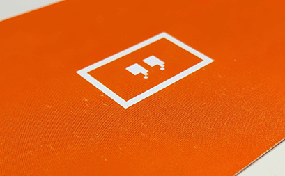
While our old logo was kinda cool, we thought some of you might find it boring and too generic. So, we sat down with Ioannis, our designer from the Starttech Ventures team, to create a new logo that better matched what we are trying to achieve with Yodeck. We wanted to focus on the key concept that drove us to our decision to create Yodeck in the first place, what our users ultimately need; a simple way to say something on screen.
We needed our logo to be “simple” in the eye. Something having to do with “digital”. And stay in context with what Yodeck actually provides, “content”. So, we ended up with a great design that incorporated all of these values in a clear form.
Then came the color decision. I am colorblind myself, so I am not the best person to make that decision. But orange is one of the few color I like, since it’s easy to distinguish even for me. We ended up using a reddish orange, which is not to harsh to the eye, yet it’s colorful enough to draw attention.

Website & Blog
Our previous website was a static page with a signup form. We needed a dynamic site, capable to offer the flexibility we needed concerning content and blogging. WordPress came to the rescue!
Based on our new branding, we concluded on a design that was also simple and clear. Hope you like it!
We will be running 2 distinct sections in our blog, our general Yodeck blogging section, and an engineering section with posts related to Raspberry Pi, coding and engineering issues.
Let the blogging begin!